30+ Best Resume Fonts to Use in 2026
Choose from 30+ of the best resume fonts for 2026 to create a clean, professional, and ATS-friendly resume that stands out to recruiters.
Overview
Fonts play a bigger role in job applications than most people realize. The right typeface can improve readability, pass ATS filters, and make your resume look polished and professional. In this post, we’ve rounded up 30+ of the best resume fonts for 2026, along with size and style tips to help you make a strong first impression.
When applying for a job, even the smallest design choices on your resume can affect the first impression you make. From layout to formatting, the font you choose plays a crucial role in how professional and polished your resume appears. Many candidates focus on content but overlook typography — yet, choosing the best font for resume presentation can determine whether a recruiter actually reads your application.
A professional resume font not only improves readability but also helps your document pass through Applicant Tracking Systems (ATS) smoothly. Poor font choices, on the other hand, can make your resume look cluttered or even cause parsing issues in ATS filters.
Recruiters spend an average of 6–8 seconds scanning each resume. A clean and legible typeface can help your skills and experience stand out instantly. In this guide, we’ll break down the top fonts for modern resumes, explain which font is best for resume design, and share expert tips on choosing the right resume font size and style to make a lasting impression.
What Is the Best Font for a Resume?
Choosing the right font ensures your resume is professional, readable, and ATS-friendly. A clean font makes a strong first impression on recruiters.
Top Best Resume Fonts:
Calibri – Modern and easy to read on screens.
Arial – Simple, professional, and works well digitally.
Helvetica – Sleek and minimal, ideal for creative or corporate roles.
Times New Roman – Traditional and formal, great for conservative industries.
Georgia – Elegant, readable, and works well in print.
Why Resume Fonts Matter
Your resume font does more than make your document visually appealing it influences how employers perceive your professionalism, communication style, and attention to detail.
Readability
Recruiters need to skim dozens of resumes quickly. A simple, well-spaced font allows them to scan for key information like job titles, achievements, and skills without strain.
Professionalism
The best font for a resume conveys seriousness and confidence. Fonts that are too casual or decorative can make your application look unprofessional.
ATS Compatibility
Many companies use ATS software to filter resumes. Certain fonts don’t convert properly in these systems, which may cause layout errors or missing text. Using an ATS-friendly resume font ensures your document remains readable by both machines and humans.
Industry Fit
Different industries value different aesthetics. For instance, traditional fields like law or finance prefer classic serif fonts, while design or tech companies lean toward modern, sans-serif fonts.
Also Read:Resume Summary for Freshers
Factors to Consider When Choosing Resume Fonts
Before finalizing your typeface, keep these key factors in mind:
Readability: Choose fonts that are easy to scan both on-screen and in print. Avoid overly stylized or handwritten fonts.
Professional Appeal: Use fonts that are standard in business communication.
ATS-Friendly: Stick with widely supported fonts such as Calibri, Arial, Cambria, or Helvetica.
Consistency: Use one or two fonts across the resume — one for headings and one for body text.
Industry Relevance: Serif fonts (like Times New Roman or Garamond) work well for traditional fields; sans-serif fonts (like Arial or Calibri) suit modern roles.
30+ Best Resume Fonts to Use in 2025
Choosing the right font can make a big difference in how recruiters view your resume. The best resume fonts are clean, professional, and easy to read whether printed or scanned by an ATS.
Here are over 30 resume fonts that balance style, readability, and professionalism for 2025.
1. Calibri
Clean, modern, and Microsoft Word’s default font.
Highly readable on screens and ATS-friendly.
Best for: All industries from finance to IT.
2. Arial
Simple, familiar, and widely used in business documents.
Gives a fresh and minimal look to resumes.
Best for: Business, marketing, and corporate jobs.
3. Helvetica
Sleek, modern, and used in many design portfolios.
A favorite among creative professionals.
Best for: Designers, developers, and brand experts.
4. Times New Roman
Classic and formal a go-to for traditional industries.
Perfect for printed resumes or formal applications.
Best for: Legal, academic, and government positions.
5. Georgia
A serif font optimized for screens and readability.
Professional yet stylish, suitable for senior roles.
Best for: Marketing, writing, and leadership roles.
6. Garamond
Elegant and old-school, perfect for academic resumes.
Gives your document a refined, scholarly look.
Best for: Researchers, professors, and executives.
7. Cambria
Created for Microsoft Office and screen readability.
Structured, neat, and ATS-friendly.
Best for: Engineers, consultants, and business analysts.
8. Verdana
Wide spacing improves readability on screens.
Looks great in smaller sizes and digital formats.
Best for: Remote jobs or digital-first companies.
9. Tahoma
Compact and simple with excellent legibility.
Ideal for resumes with dense content.
Best for: IT, project management, and analytics.
10. Trebuchet MS
Modern sans-serif with bold character shapes.
Stylish without being too informal.
Best for: Creative professionals and marketing roles.
11. Calisto MT
Sophisticated serif font that looks polished and stable.
Provides a traditional yet elegant tone.
Best for: Education, law, and HR professionals.
12. Book Antiqua
A softer serif font that feels approachable and clear.
Readable even in smaller text sizes.
Best for: Teaching, publishing, or social services.
13. Century Gothic
Geometric, clean, and modern-looking.
Offers a minimalist feel while staying professional.
Best for: Tech, startups, and creative industries.
14. Corbel
Balanced sans-serif font with smooth curves.
Looks neat on digital and printed formats.
Best for: Admin, HR, and customer service jobs.
15. Constantia
Designed for comfortable reading in print or on screen.
Professional yet slightly decorative.
Best for: Communications, marketing, and education.
16. Didot
Elegant, refined, and fashion-industry favorite.
Ideal for portfolios or creative resumes.
Best for: Designers, photographers, and stylists.
17. Lato
Modern sans-serif with excellent readability.
Great for resumes with a clean, digital aesthetic.
Best for: Developers, marketers, and freelancers.
18. Open Sans
Neutral, legible, and ATS-compliant.
Looks great in PDF resumes and online applications.
Best for: Remote jobs, tech, and digital marketing.
19. Raleway
Stylish sans-serif font with thin lines.
Adds personality while keeping it professional.
Best for: Creative roles and startups.
20. Roboto
Google’s signature typeface modern and reliable.
Compatible across devices and ATS systems.
Best for: IT, digital, and tech-based roles.
21. Montserrat
Clean and geometric with contemporary appeal.
Works well in resume headers and section titles.
Best for: Designers, developers, and creative pros.
22. Nunito
Rounded sans-serif font with friendly character.
Readable, soft, and visually balanced.
Best for: Marketing, education, and communication fields.
23. Source Sans Pro
Professional and neutral sans-serif from Adobe.
Great balance between simplicity and elegance.
Best for: Tech, startups, and corporate jobs.
24. Poppins
Modern geometric font that looks sharp and balanced.
Perfect for digital resumes or Canva templates.
Best for: UX/UI designers, web developers, and marketers.
25. Josefin Sans
Retro-inspired yet modern and clear.
Adds personality without looking unprofessional.
Best for: Creative industries and startups.
26. Merriweather
A serif font designed for readability on screens.
Looks formal yet inviting.
Best for: Education, research, and communications.
27. Baskerville
A timeless serif font known for its elegance.
Ideal for formal applications and long resumes.
Best for: Law, academia, and government roles.
28. Palatino Linotype
Classic typeface with a touch of sophistication.
Keeps resumes neat and easy to scan.
Best for: Writers, editors, and educators.
29. Avenir
Balanced and modern sans-serif with strong clarity.
Gives a professional yet stylish impression.
Best for: Consultants, engineers, and marketing roles.
30. Franklin Gothic
Bold and impactful sans-serif font.
Ideal for section headings or executive resumes.
Best for: Sales, leadership, and management positions.
31. Lucida Sans
Simple and readable on both screens and paper.
A solid choice for applicants who prefer clarity.
Best for: Customer service and support roles.
32. IBM Plex Sans
Corporate yet contemporary excellent balance.
A great option for digital resumes.
Best for: IT, software, and data science jobs.
33. PT Sans
Professional sans-serif with solid spacing.
Readable at smaller font sizes.
Best for: Entry-level and mid-level professionals.
34. Noto Sans
Universal font that supports many languages.
Perfect for international job applications.
Best for: Global roles and multilingual resumes.
35. Exo 2
Tech-inspired sans-serif with futuristic appeal.
Ideal for digital-first careers.
Best for: Developers, engineers, and designers.
Fonts to Avoid in Resumes
No matter how creative you want to be, avoid fonts that reduce readability or appear informal.
Comic Sans: Too casual for professional documents.
Papyrus: Overly stylized and difficult to read.
Cursive or Script Fonts: Hard to scan and not ATS-friendly.
Uncommon Fonts: May not render correctly on different devices.
Also Read:Best CV Format for Job
Resume Font Size and Style Tips
Even the best font for resume won’t work if your formatting is inconsistent. Font size, spacing, and hierarchy determine how recruiters navigate your document.
Recommended Resume Font Size
Body text: 10–12 pt (depending on font type)
Section headings: 12–14 pt
Your name: 14–16 pt to stand out
Font Weight and Emphasis
Use bold text for section titles or company names and italics for job titles or dates. Avoid underlining it makes the document look cluttered.
Line Spacing and Margins
Keep line spacing between 1.0 and 1.15 for balance.
Maintain margins of 0.5–1 inch on all sides to ensure enough white space.
Proper spacing improves both visual flow and ATS readability.
Industry-Specific Font Suggestions
Each industry has its own tone and visual expectations. Here’s how to tailor your resume font style for better alignment.
| Industry | Recommended Fonts |
|---|---|
| Traditional (Law, Finance, Government) | Times New Roman, Cambria, Garamond |
| Creative (Design, Marketing, Media) | Helvetica, Calibri, Trebuchet MS |
| Technology (IT, Software, Data Science) | Arial, Verdana, Calibri |
| Academia & Research | Garamond, Georgia, Cambria |
Choosing a font that fits your industry gives your resume a professional edge and signals that you understand the field’s communication style.
Examples of Strong Resume Font Pairings
Pairing two fonts can create visual hierarchy without looking inconsistent. Here are some combinations that work well:
Calibri (body) + Georgia (headings): Balanced and professional.
Arial (body) + Helvetica (headings): Sleek and modern for digital roles.
Garamond (body) + Cambria (headings): Traditional and elegant.
If you use two fonts, make sure they complement each other and maintain consistent spacing.
Common Mistakes to Avoid
Even with the right resume font size and style, poor formatting can hurt your application. Watch out for these errors:
| Mistake | Impact |
|---|---|
| Using more than two fonts | Creates visual clutter |
| Font too small (<10 pt) | Hard to read, looks cramped |
| Using decorative fonts | Appears unprofessional |
| Inconsistent formatting | Distracts from your experience |
| Ignoring ATS-friendly options | Resume may not be parsed correctly |
A polished and consistent layout reflects organization and attention to detail qualities every recruiter values.
Pro Tip: Test Your Resume Font for ATS Compatibility
Before submitting your application, upload your resume to an ATS scanner or AI-based resume checker like Sound CV
It reviews your formatting, keyword use, and font compatibility to ensure your resume performs well across hiring systems. This step can dramatically improve your chances of landing an interview.
Conclusion
Your resume is your personal marketing document and the font you choose plays a key part in how it’s perceived. Selecting the best font for resume formatting can make your application look polished, organized, and professional.
Stick to readable, ATS-friendly fonts such as Calibri, Arial, or Garamond, and maintain consistent spacing and sizing. Avoid overly stylized fonts that distract from your content. By focusing on clarity, professionalism, and simplicity, you’ll make it easier for hiring managers to focus on what matters your qualifications.
Updating your resume font size and style is one of the simplest yet most effective ways to boost readability and impact. A small design choice can make a big difference in how recruiters remember you.
FAQs
Frequently asked questions about this topic
Related Blogs
Explore more insights and guides you might like.
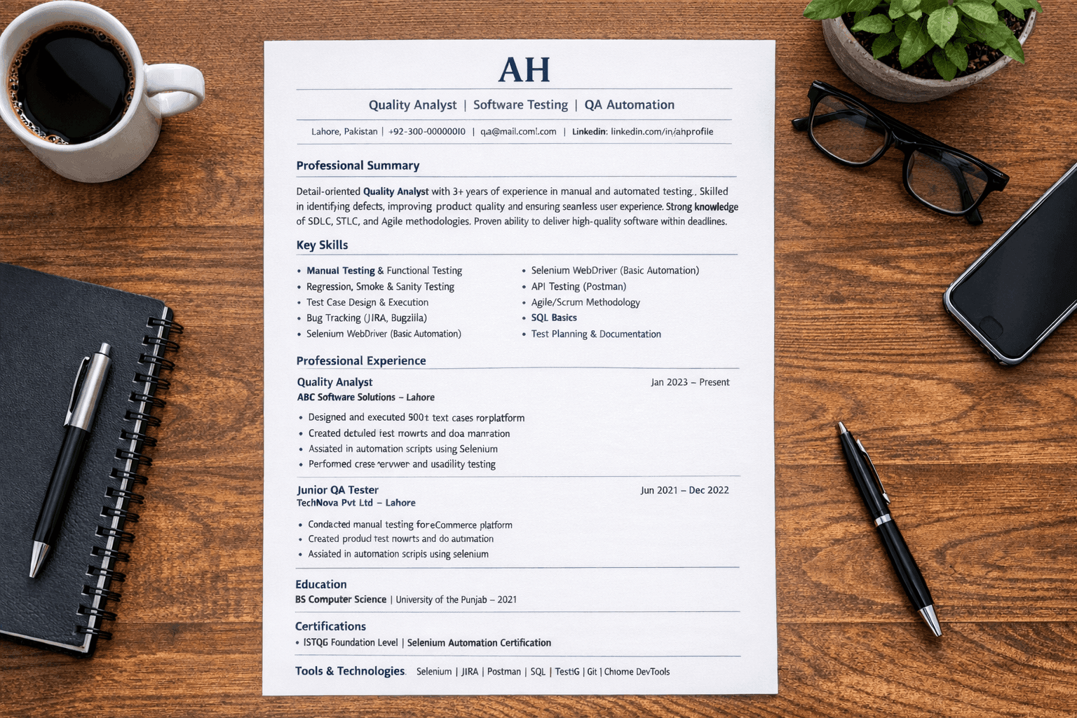
Quality Analyst Resume Guide (2026) | ATS-Friendly QA Resume Tips
Create an ATS-friendly Quality Analyst resume with proven tips, key skills, and formatting strategies to land your dream QA job faster.
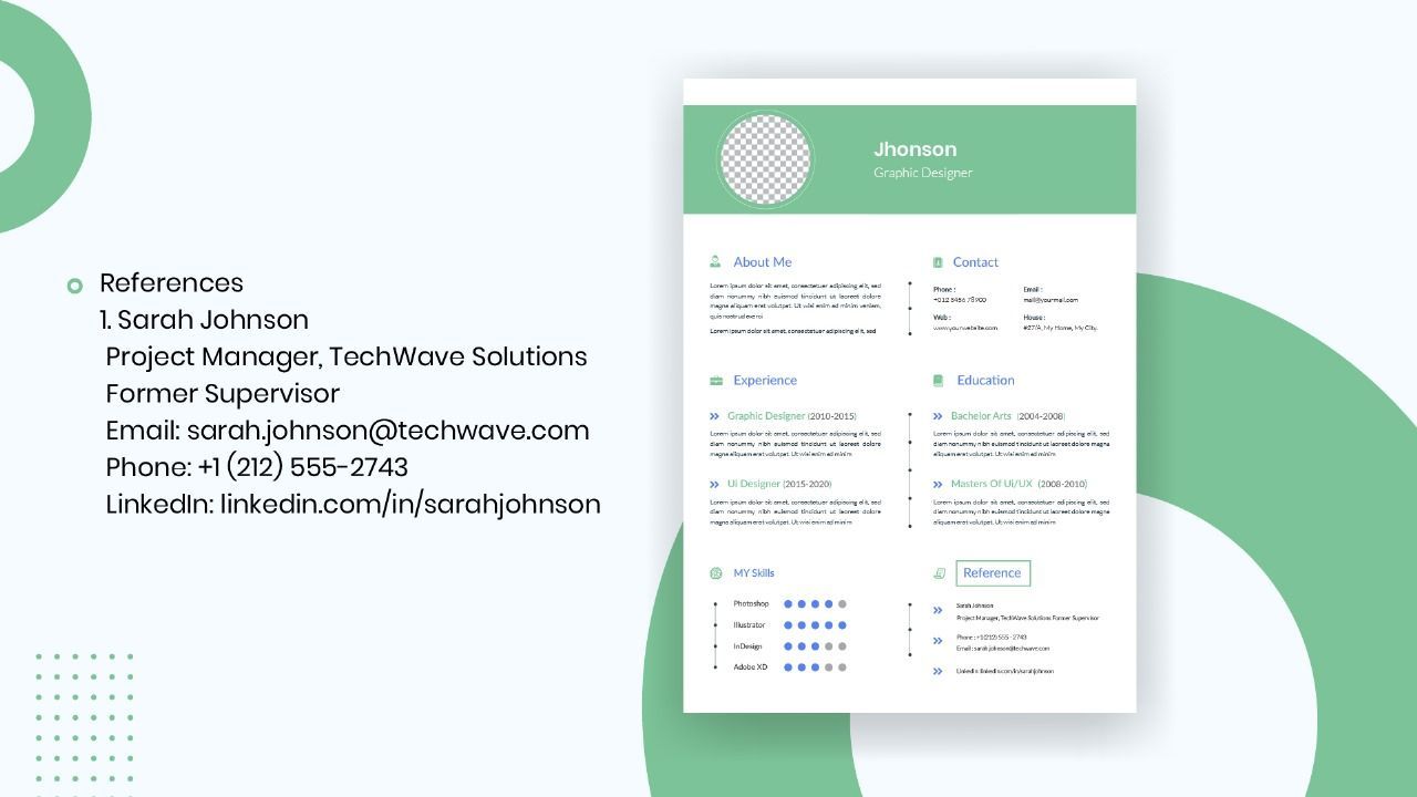
How to List References on a Resume in 2026
Learn the modern 2026 approach to listing references on your resume for maximum professionalism and recruiter impact.

Resume for Government Job: Federal Resume Format Guide
A complete guide to writing an accurate, ATS-friendly resume for government jobs that meets official recruitment standards.